01 / Project overview
A presence that speaks softly.
Over one month, I managed branding and social media work for Veil by MJ, a UAE fashion label. The project focused on brand awareness: giving the label a recognisable visual presence through fashion imagery, consistent campaign design and digital marketing. My contribution brought photography, photo editing, AI tools and photo enhancing together with social content, a Meta ad campaign and SEO.
Project details / Skills used
Creative production meets digital marketing.
Photography · Photo Editing · Use of AI Tools · Photo Enhancing · Digital Marketing · Meta Ad Campaign · SEO. These skills connect the image-making side of the project with how the brand is presented and discovered online. The case study follows that relationship, from a consistent visual signature to editorial posts, collection communication and campaign content.
02 / Brand signature
An expressive signature. A consistent presence.
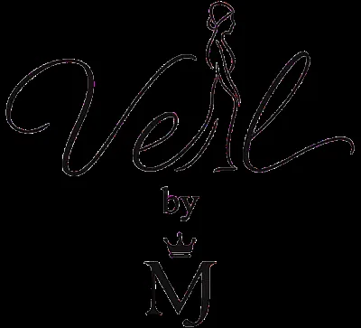
The Veil by MJ mark combines flowing script, a fashion silhouette and a crowned MJ monogram. Across the artwork, the signature appears in light or gold treatments, supported by restrained placement and a visible website address. It gives each composition a recognisable point of connection.
03 / Visual approach
Elegance in silence.
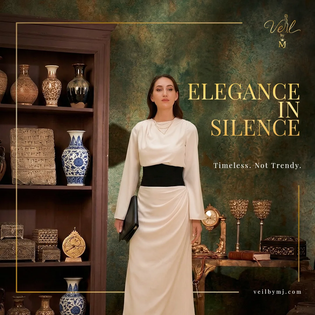
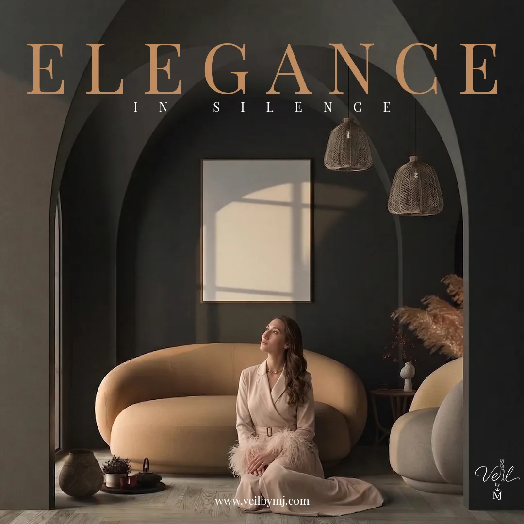
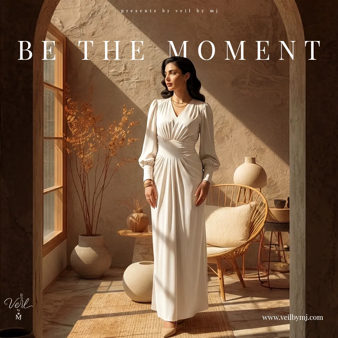
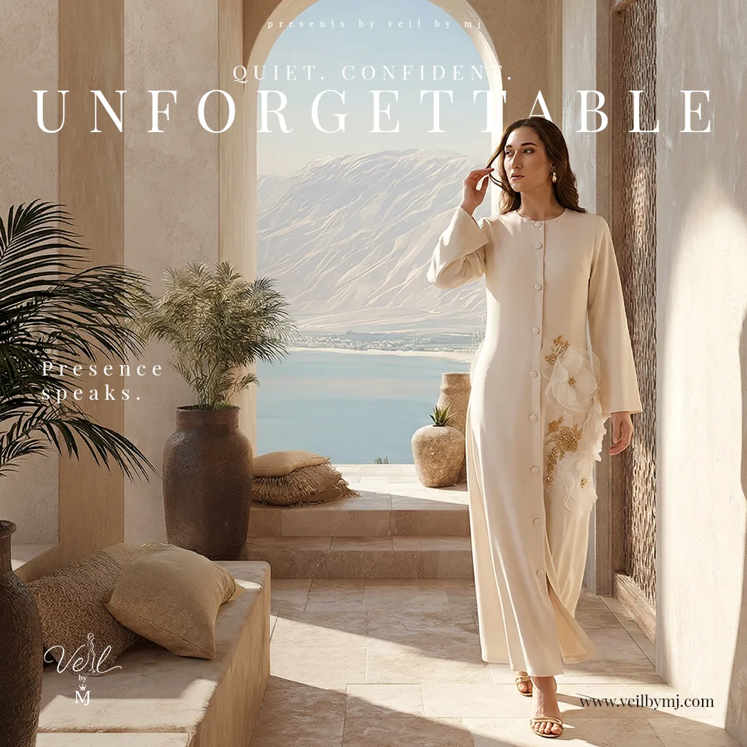
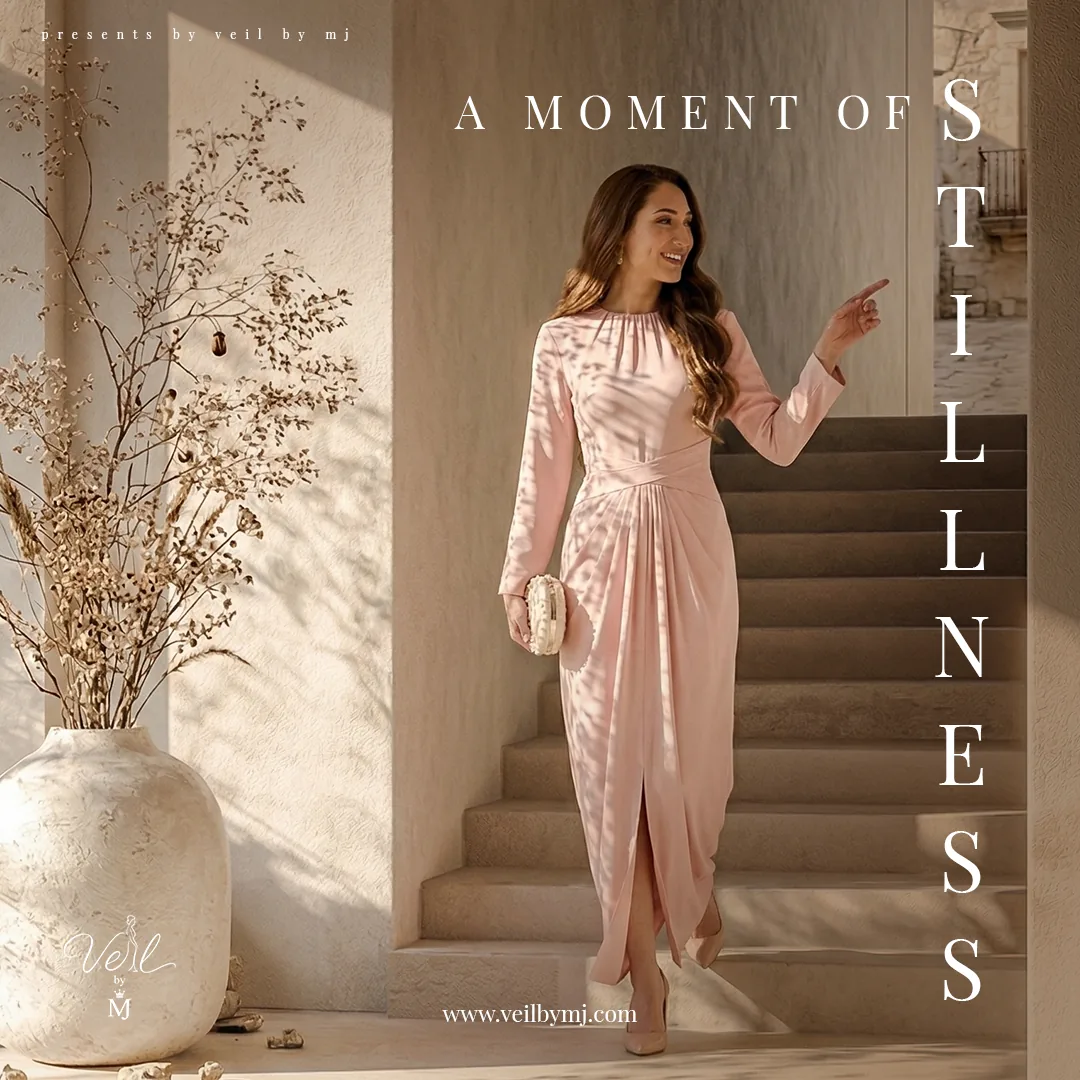
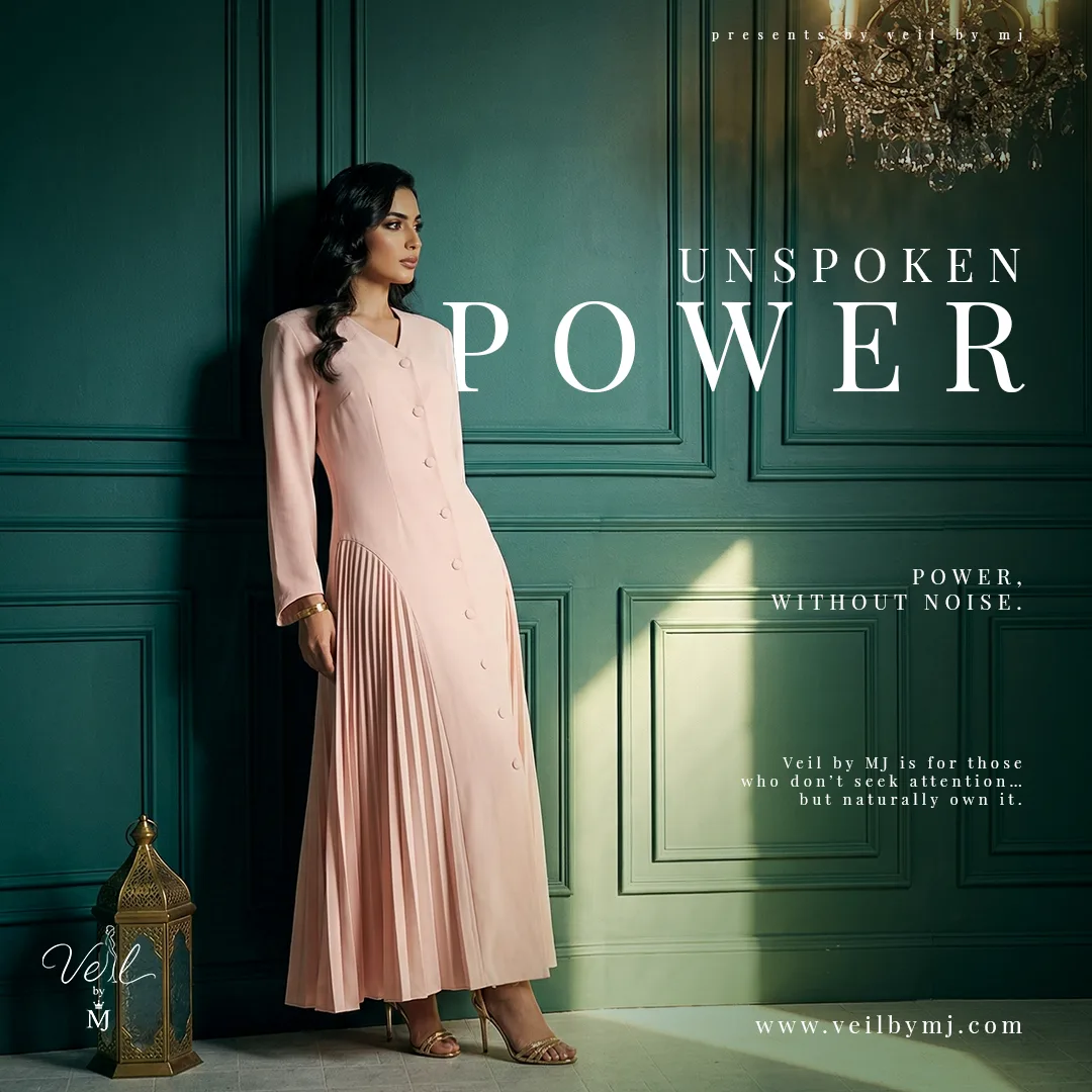
The visual language pairs graceful fashion imagery with spacious serif headlines. Warm stone, cocoa, ivory and muted gold create continuity, while deep green introduces a richer contrast. Architectural arches, textured walls and soft light frame the garments and extend the mood of each composition.
04 / Campaign family
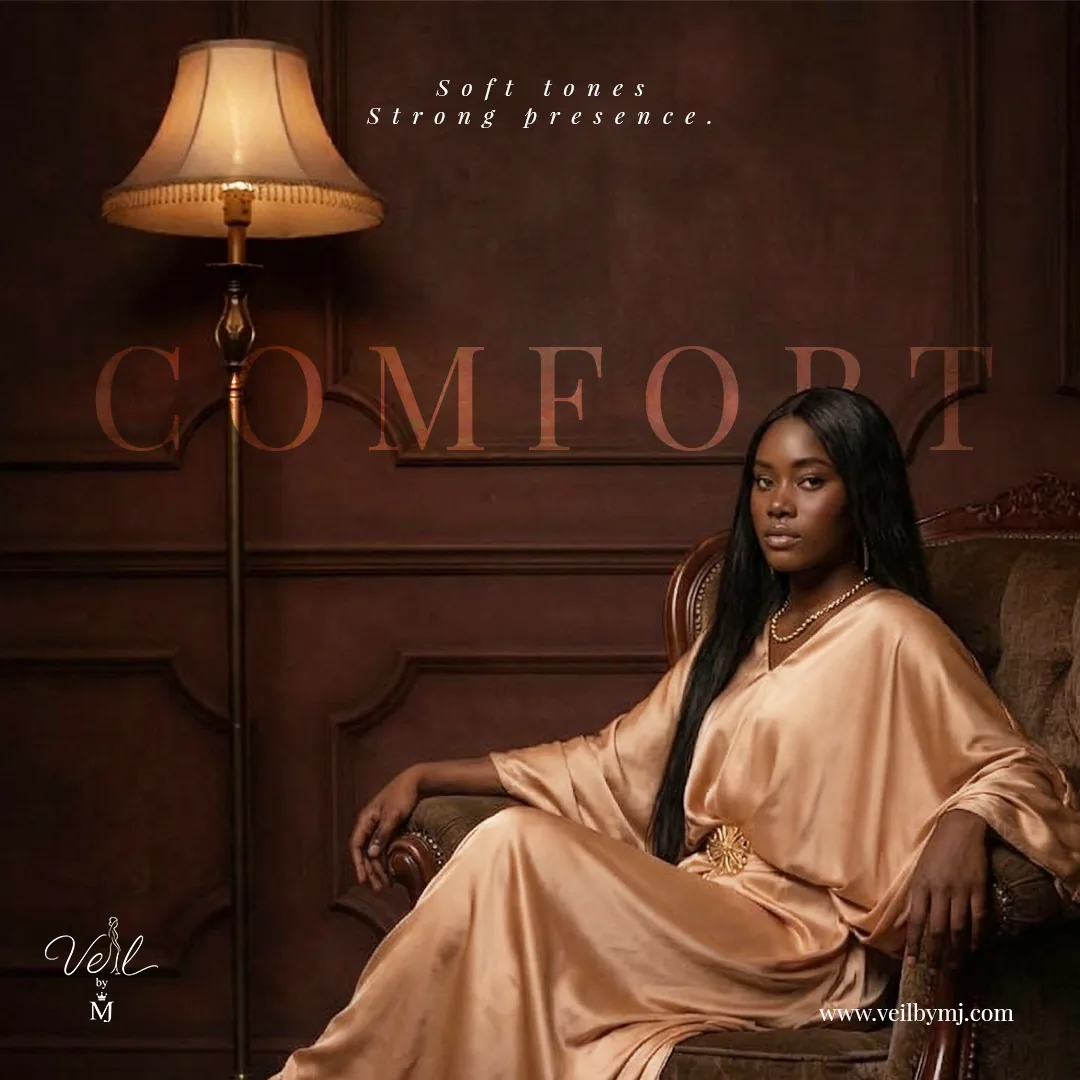
Soft tones. Strong presence.
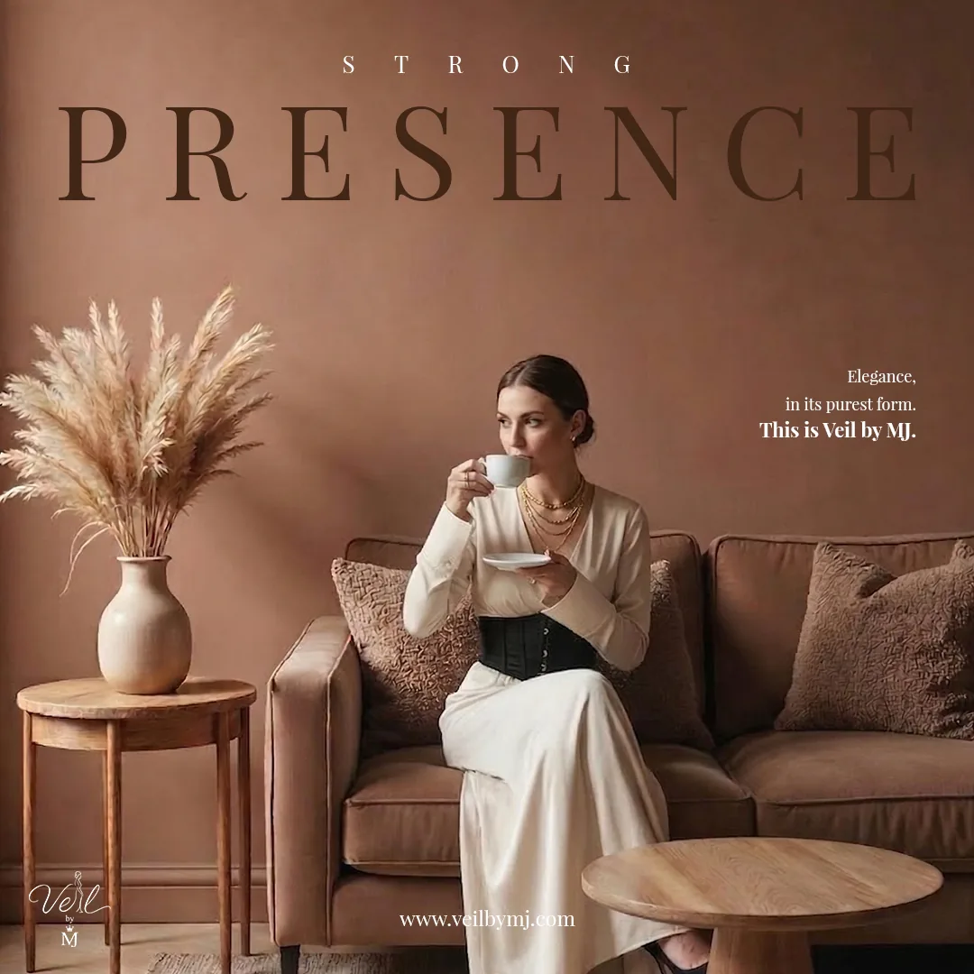
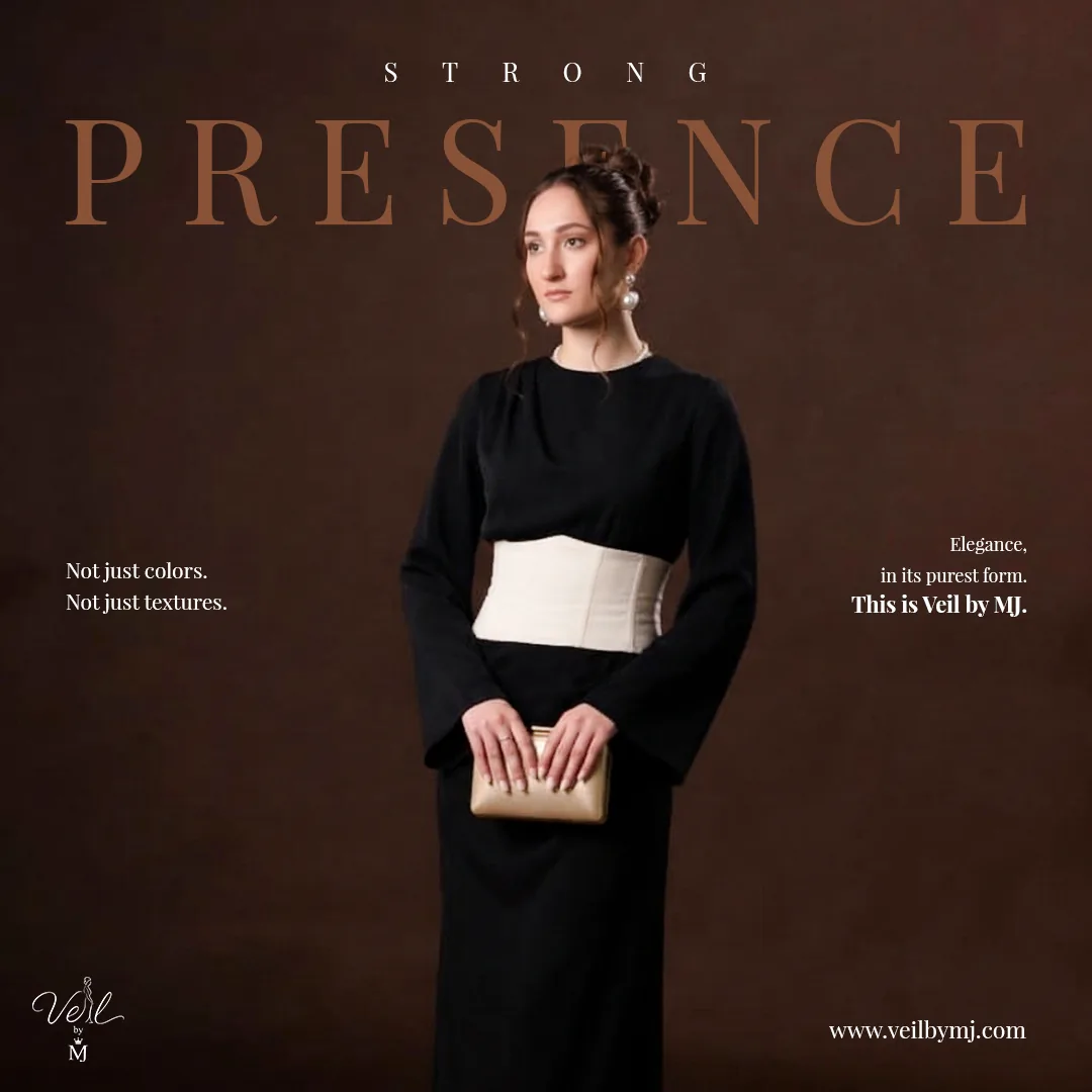
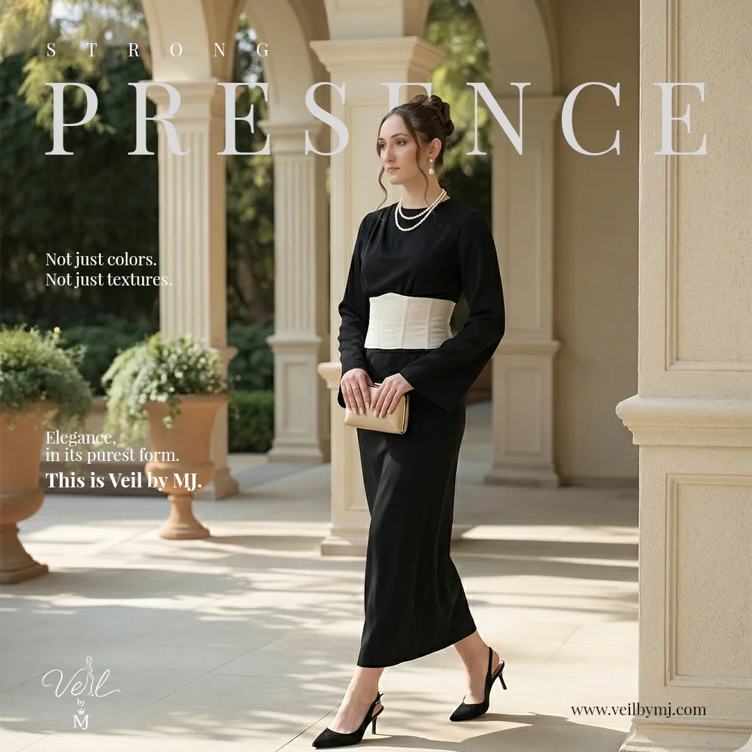
The Presence artworks repeat a generous headline and compact supporting copy across contrasting environments. Light and dark styling remain connected through typography, logo placement and a shared composition. Comfort introduces a warmer, more intimate scene while retaining that editorial rhythm.
05 / Social storytelling
Different moments. One recognisable voice.
Each post gives the fashion imagery a distinct emotional frame: being present, feeling memorable, finding stillness or expressing quiet power. Headline placement responds to the space around the subject, moving from wide horizontal statements to a vertical arrangement. The recurring serif typography and signature keep the series connected.
06 / Fashion in motion
Quiet confidence, out in the world.
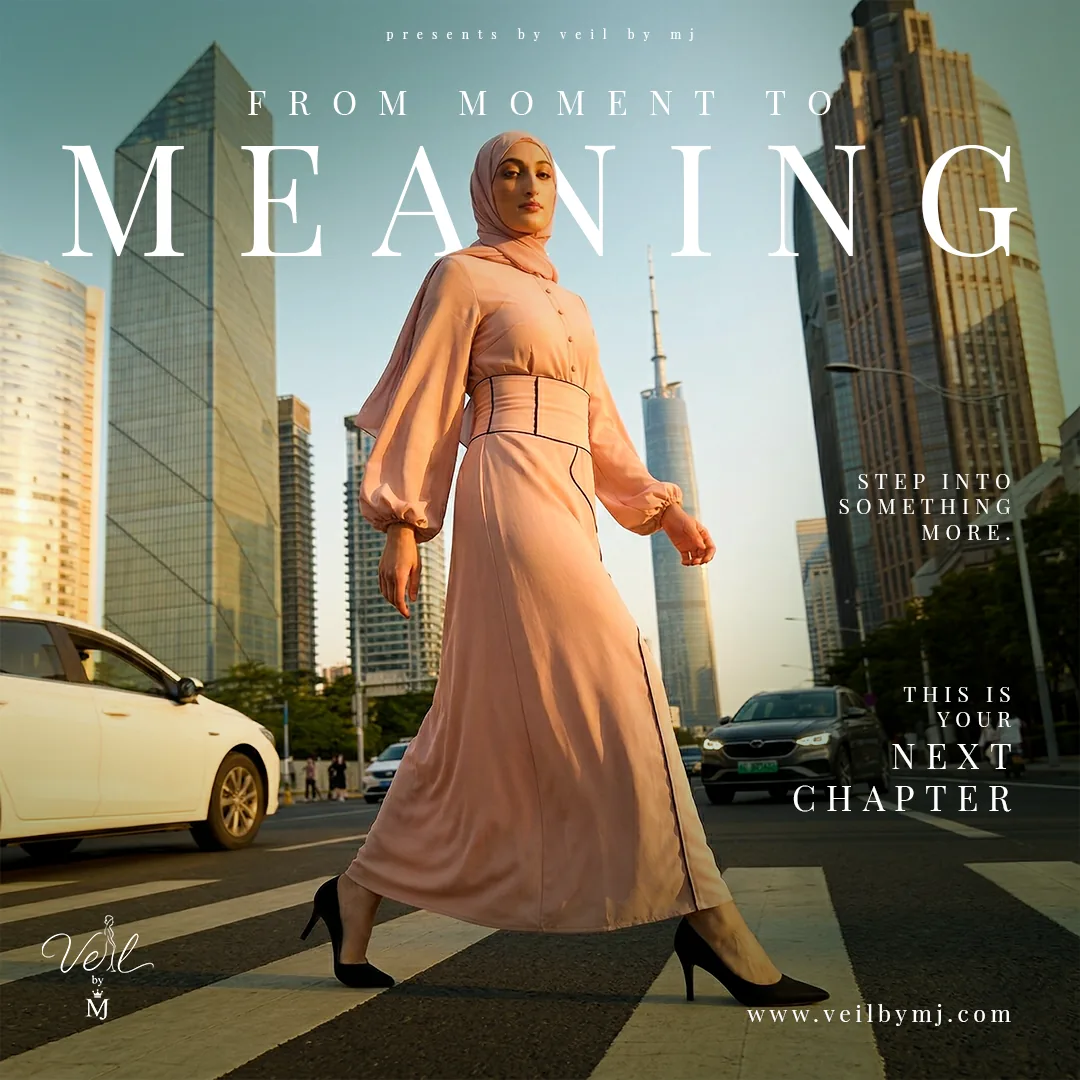
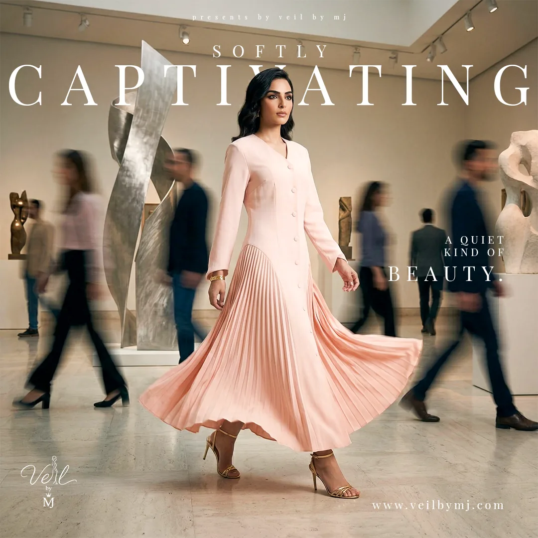
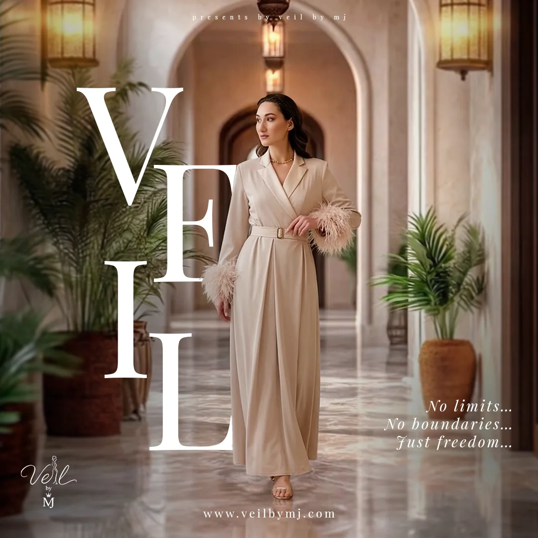
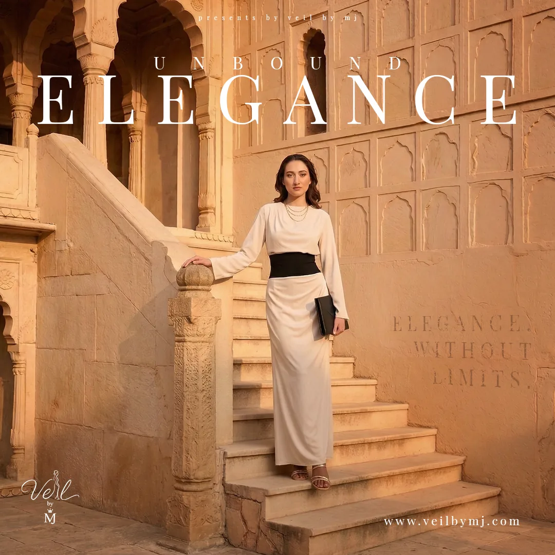
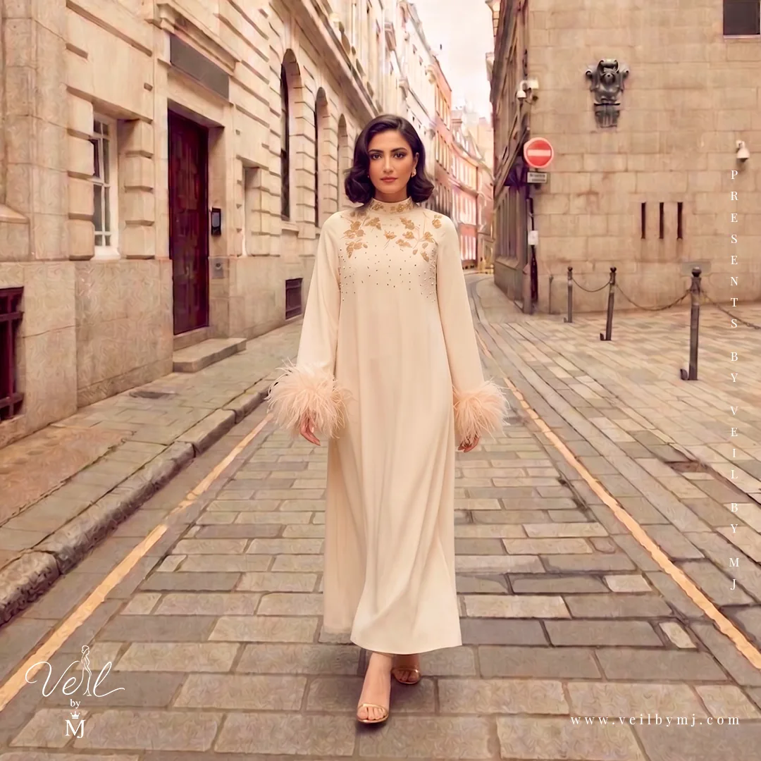
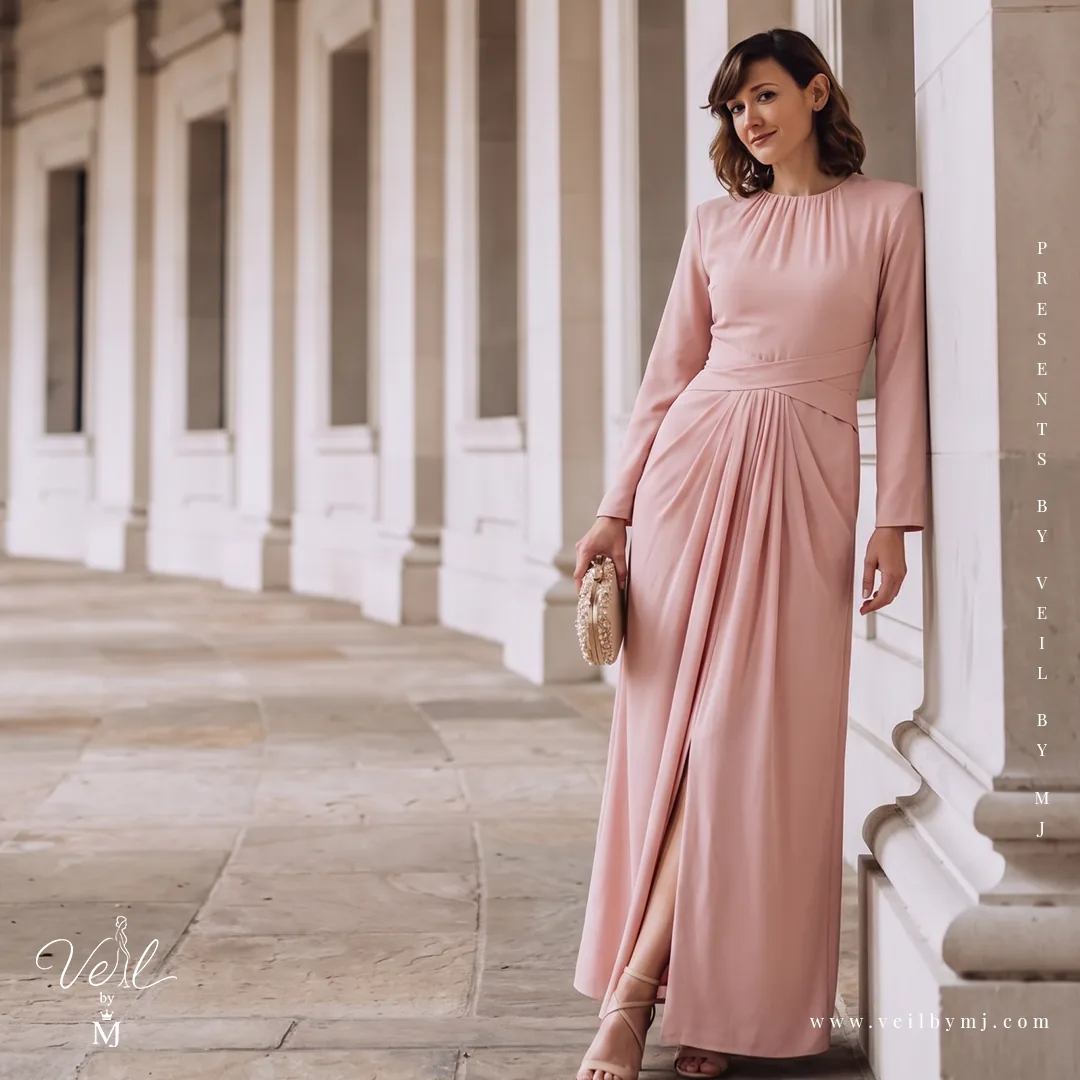
The next group moves beyond intimate interiors into city streets, a gallery and expansive architectural settings. Movement, scale and changing viewpoints give the feed variety. The shared serif headlines, restrained palette and recurring signature keep those different scenes part of the same brand story.
07 / Collection anticipation
A seasonal story with a different rhythm.
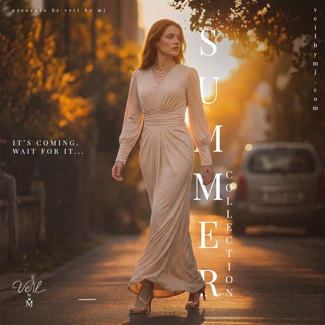
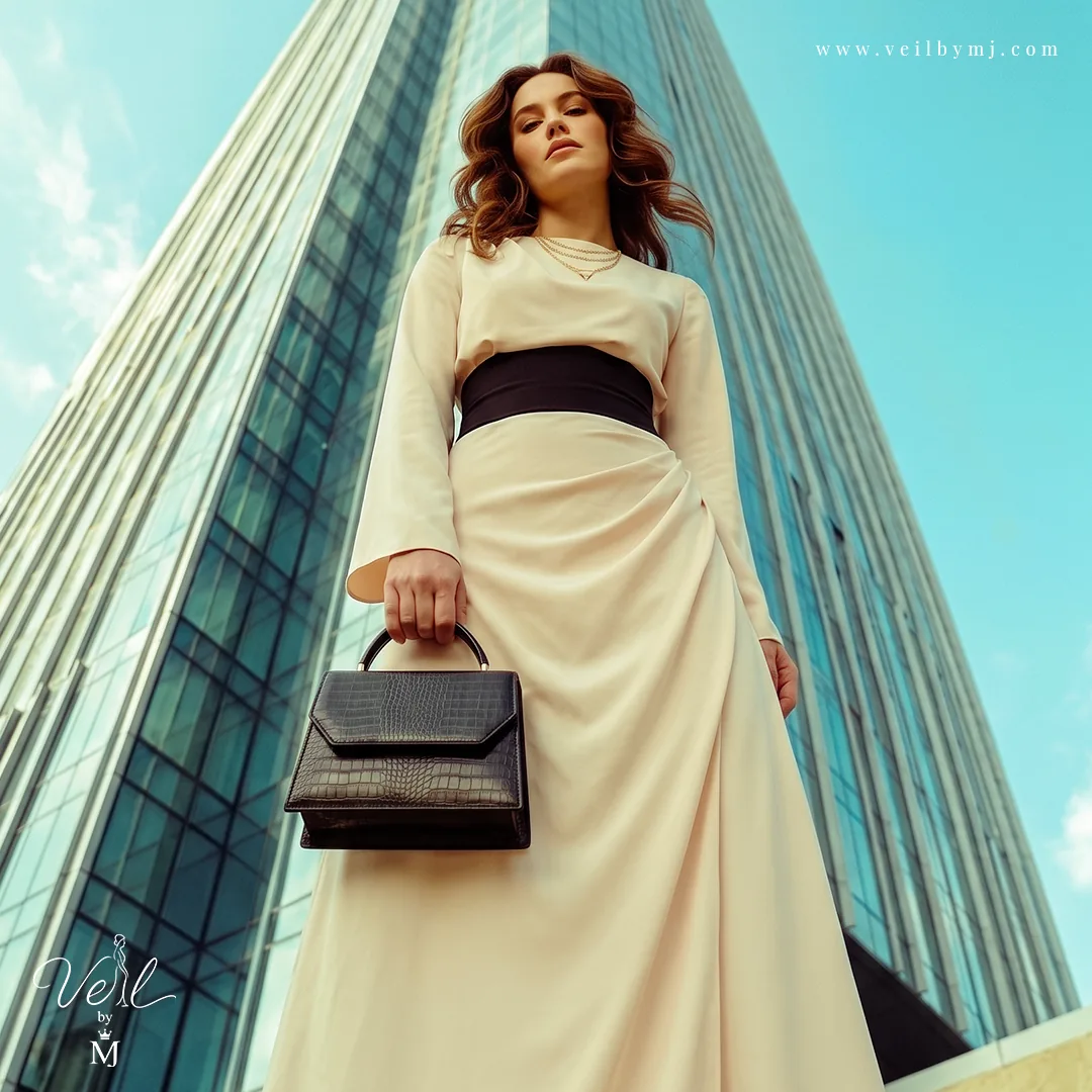
The Summer Collection artwork uses warm evening light and a vertical title to create anticipation. Alongside it, the low-angle city composition gives the same fashion language a more assertive expression. These contrasting treatments show how mood and perspective can vary while the logo, website signature and garment remain the key anchors.
08 / Limited Series
Let the collection take the lead.
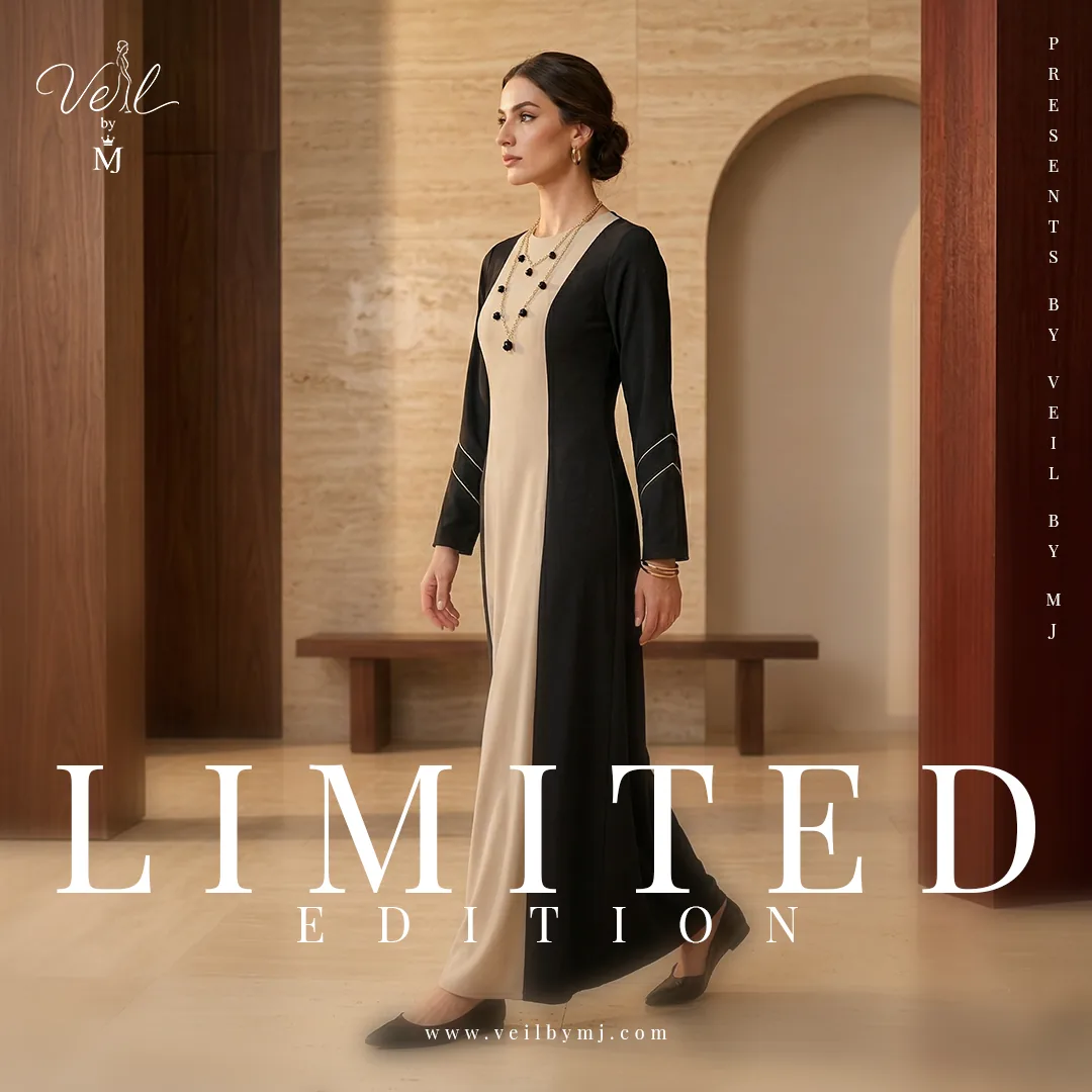
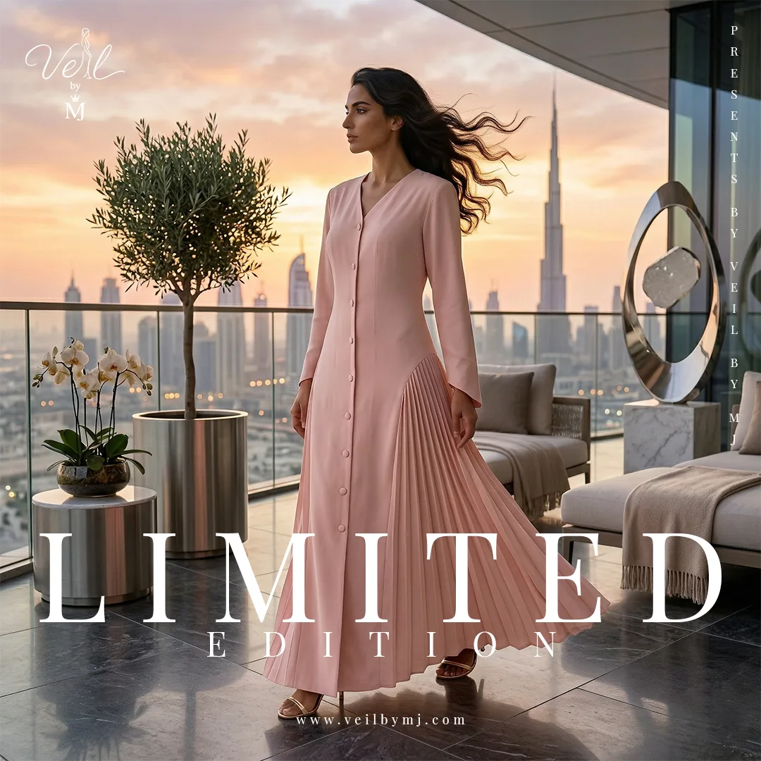
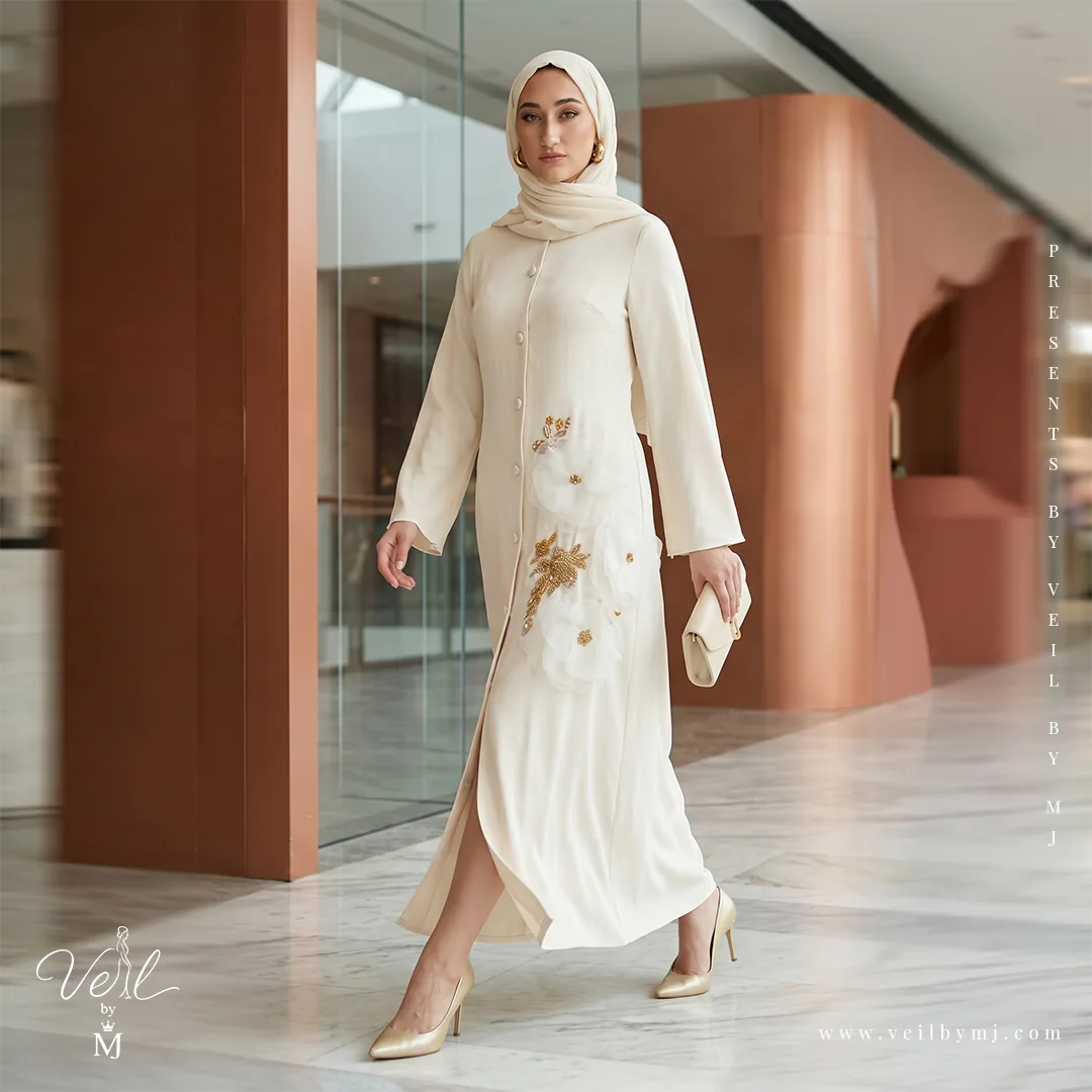
The Limited Series puts greater emphasis on the garments themselves. The first two designs use a prominent Limited Edition headline; the following images reduce the typography, leaving fabric, detailing and silhouette to carry the story. Soft neutrals, repeated branding and architectural backdrops connect all five compositions.
09 / Dress promotion
From brand atmosphere to product detail.
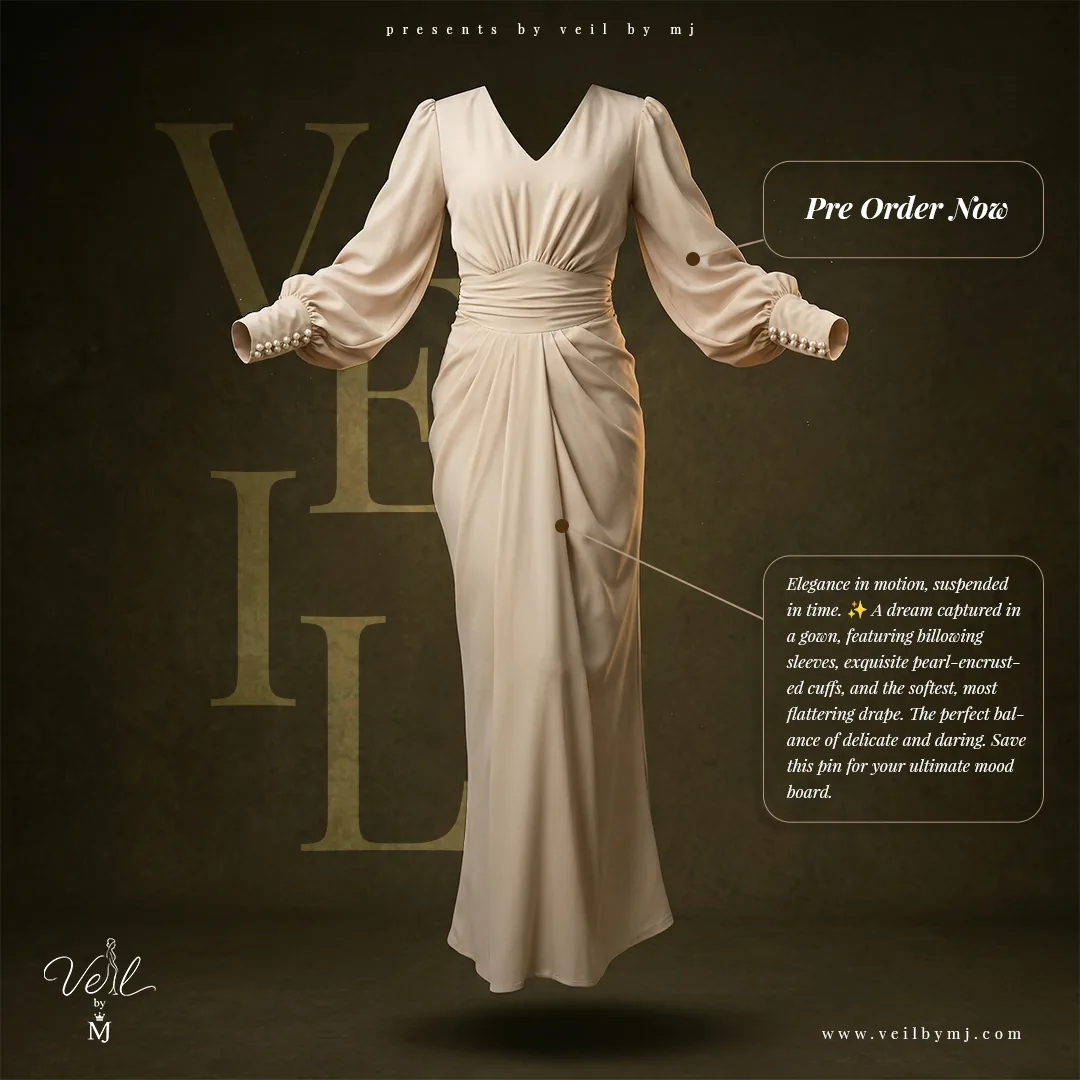
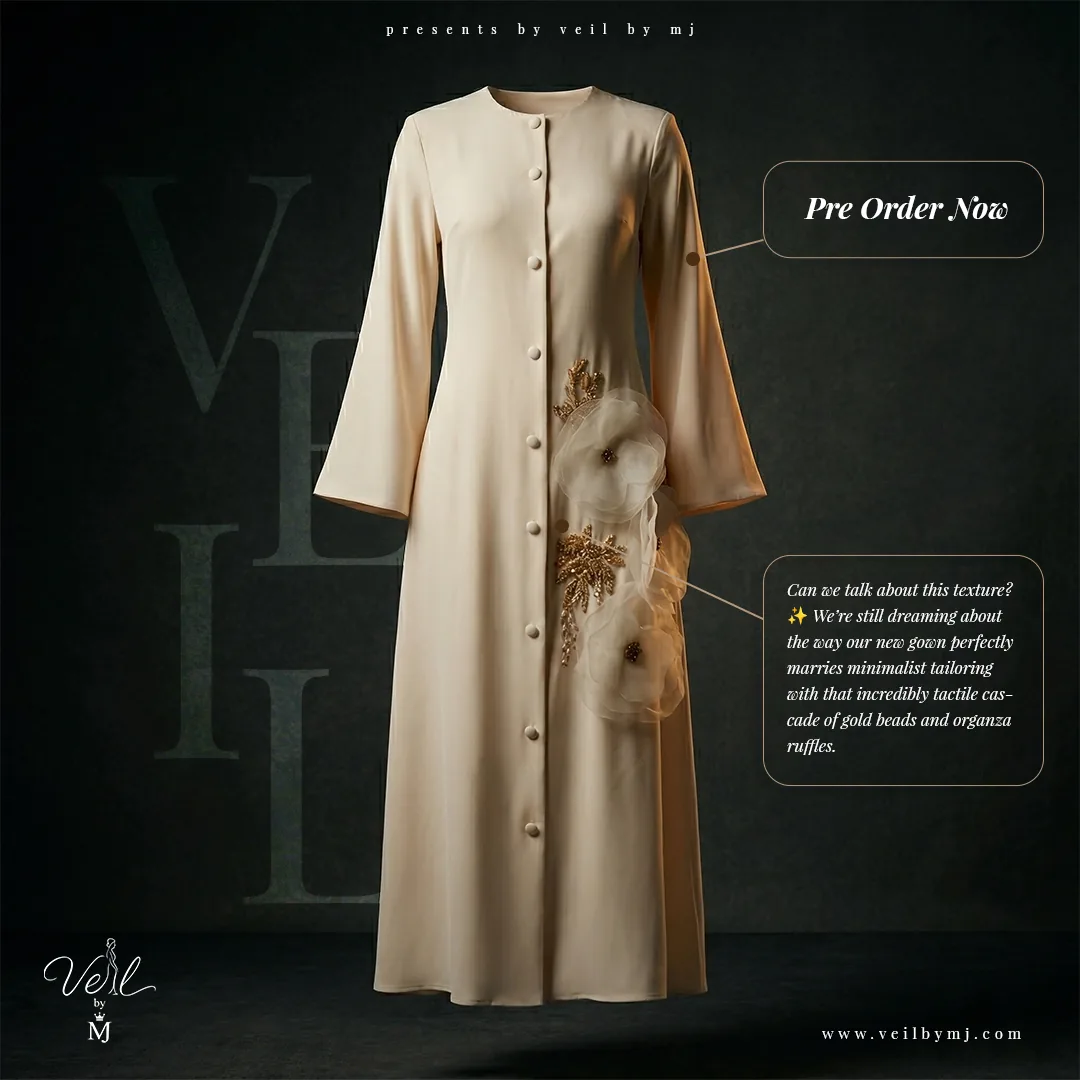
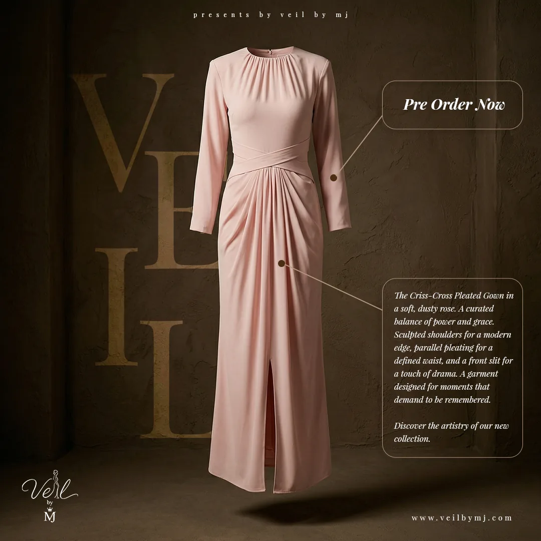
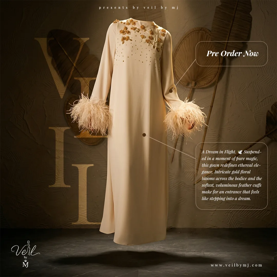
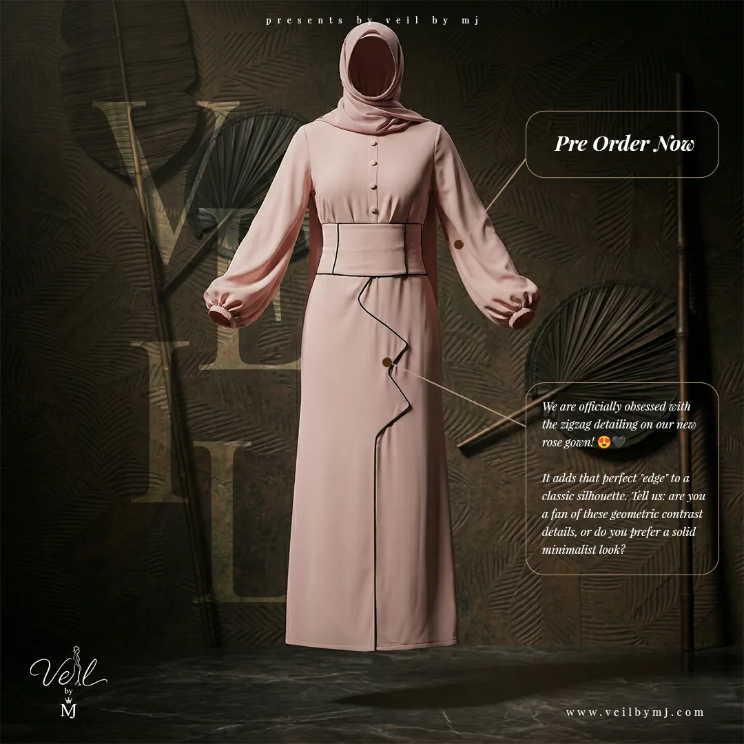
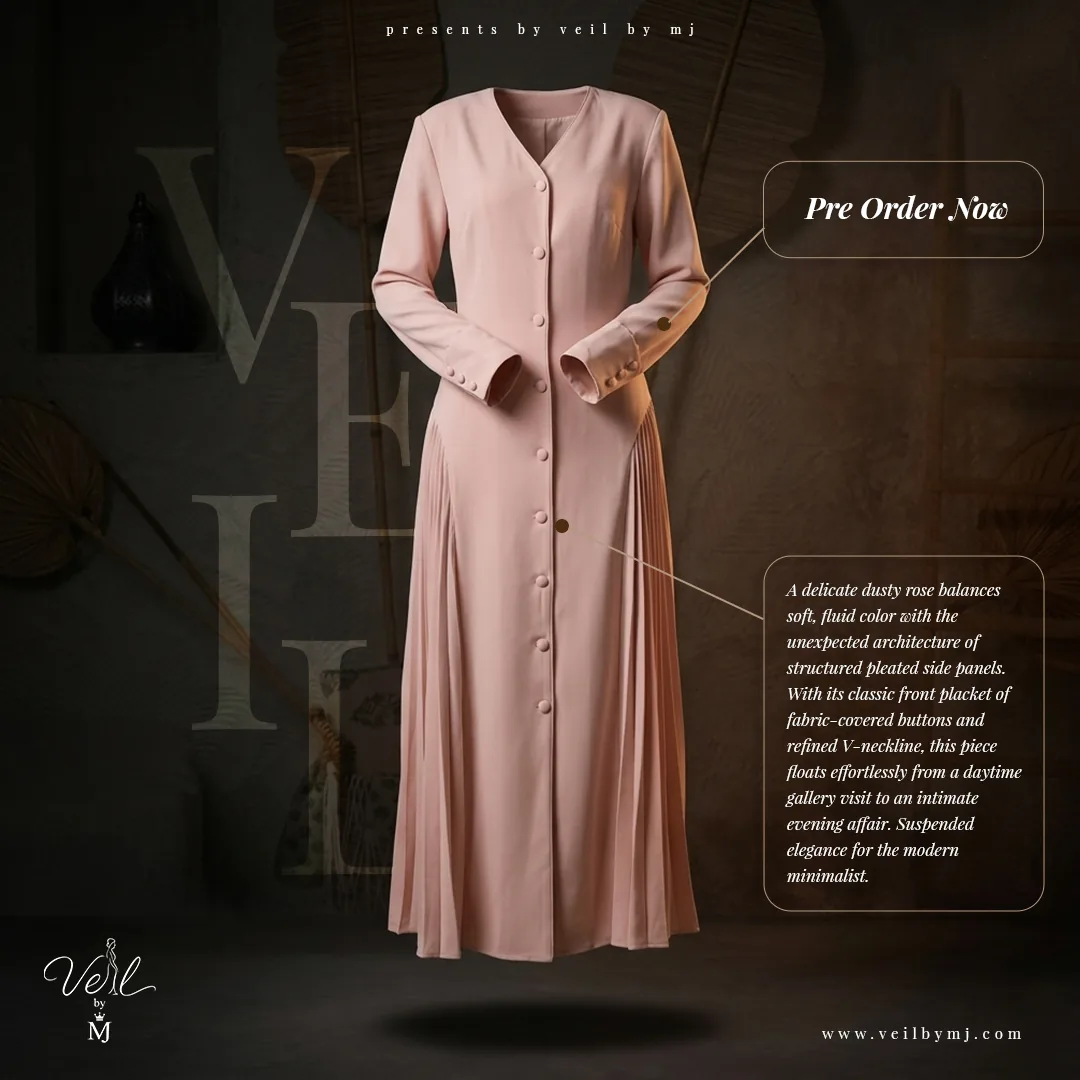
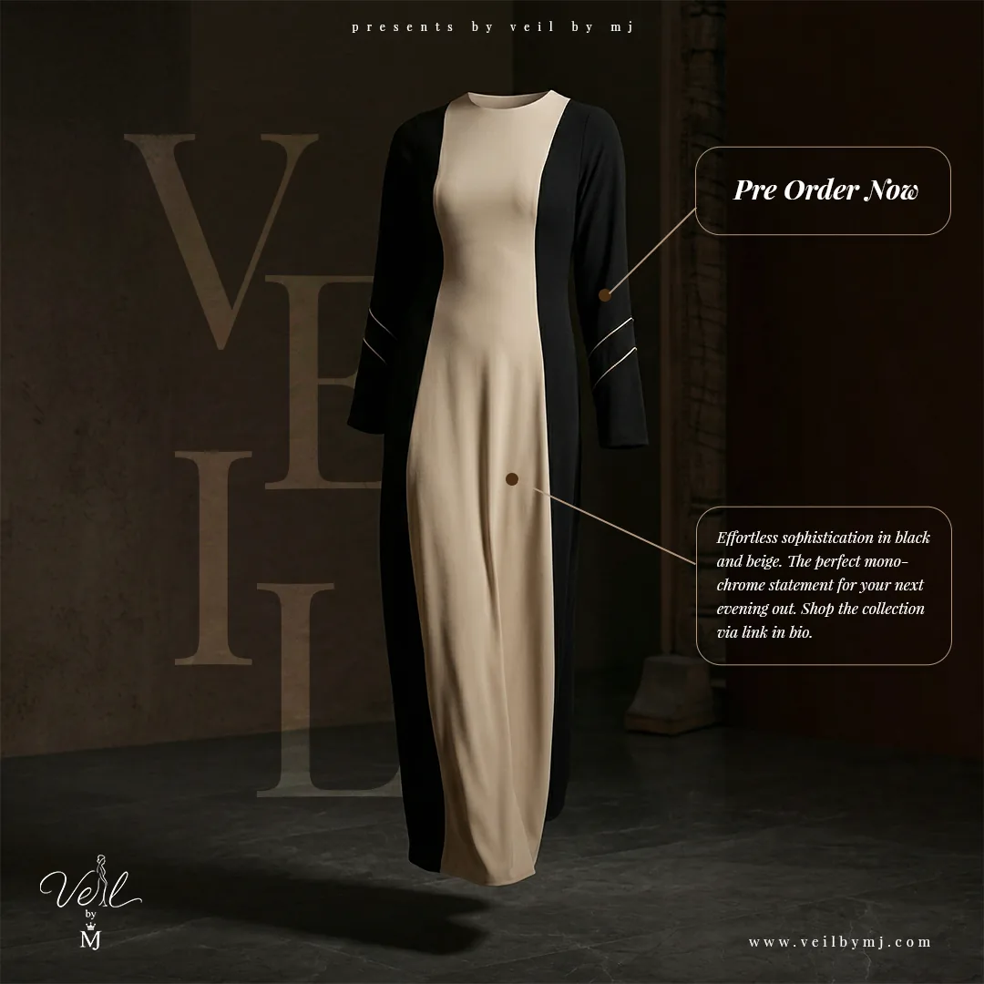
This product-focused series forms a distinct part of the same Veil by MJ campaign. Dresses are presented on their own against dark, textured backgrounds, allowing silhouette, drape and embellishment to take priority. The consistent layout links the product communication to the broader brand awareness work while giving each garment a clear individual presentation.
Product communication / Design rationale
A closer look, with a clear next step.
Fine connector lines guide attention from the dress to descriptive copy and a prominent pre-order message. Muted oversized VEIL lettering adds a branded backdrop without competing with the garment. Repeating the logo, website address and callout structure creates a recognisable series across different styles. The pre-order wording belongs to the original campaign artwork shown here.
10 / Creative craft
From image to finished communication.
Photography, photo editing, AI tools and photo enhancing formed the creative skill set behind the project. The artwork brings these disciplines into a unified presentation through tone, framing, image treatment and typography. Some compositions are led by a large statement; others give more space to garment detail. That balance helps the work function both as fashion imagery and as branded social communication.
11 / Marketing context
Build recognition across points of discovery.
Digital marketing, a Meta ad campaign and SEO were also part of my one-month scope. The brand awareness objective provides the context for the creative work: memorable visuals introduce the label, repeated identity cues support recognition, and the website address provides a clear route to explore further. The portfolio presents the campaign work and its design rationale; performance figures are not included here.
12 / Design reflection
One brand. A wider range of expression.
Across 28 selected artworks, the project moves from quiet interiors to urban scenes, seasonal anticipation, collection-focused imagery and individual dress promotion. Consistent typography and branding hold the work together while changes in colour, movement and composition keep the presentation varied. The project demonstrates my ability to connect visual craft with the wider needs of a brand awareness campaign.