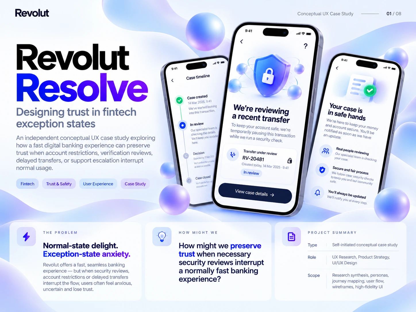
Concept overview
Designing trust in fintech exception states.
Revolut Resolve is an independent conceptual UI/UX case study exploring how a fast digital banking experience can preserve trust when account restrictions, verification reviews, delayed transfers or support escalation interrupt normal use. My work brings together research framing, product strategy, personas, journey mapping, user flows and interface design. It is not an official Revolut product.
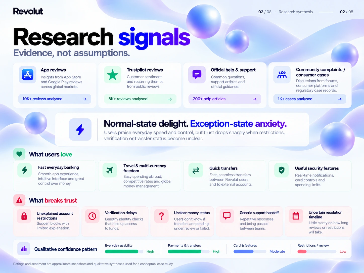
Research synthesis
Normal-state delight. Exception-state anxiety.
The concept draws on public reviews, help information and recurring community themes. Everyday banking, travel, payments and security can feel convenient, while restrictions and uncertain progress can create anxiety. The research framing focuses on unexplained restrictions, verification delays, unclear money status, fragmented support and uncertain resolution timing. The large review counts and qualitative confidence bars shown in the supplied artwork have not been independently substantiated; they are not claimed as verified study sample sizes or measured results.
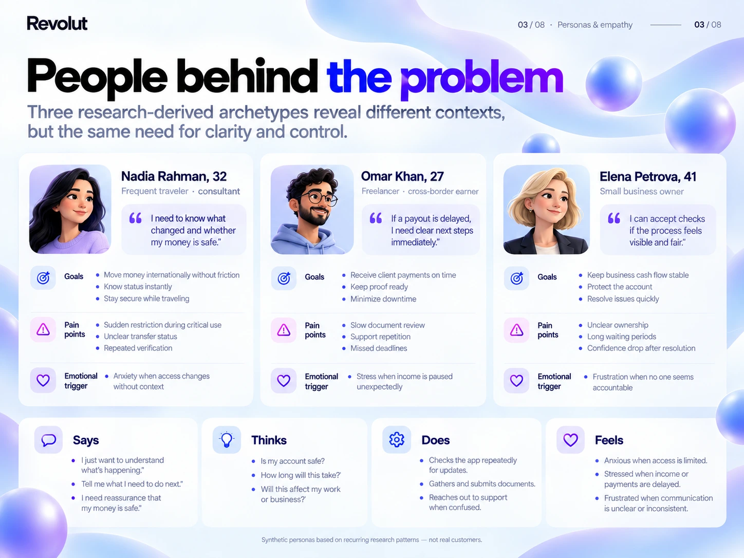
Personas & empathy
Different contexts. A shared need for clarity.
Three synthetic archetypes explore the needs of a frequent traveller, a freelancer receiving cross-border income and a small-business owner. Their priorities include access to money, predictable payment status and continuity when a review interrupts everyday tasks. Empathy prompts ask what changed, whether funds are safe and what the person should do next. Names, quotations and portraits are illustrative, not actual research participants.
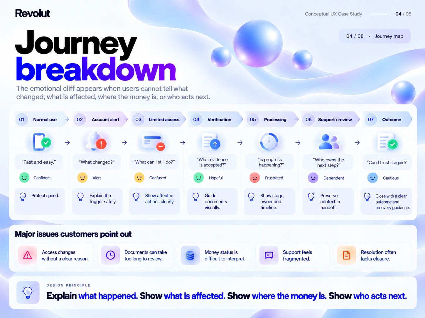
Journey mapping
Locate the moments when confidence breaks down.
The journey moves through normal use, an account alert, limited access, verification, processing, support and the outcome. Each stage identifies a question the interface should answer: what changed, what still works, what evidence is needed, whether progress is happening, who owns the next action and what the outcome means. These are proposed journey needs to validate with users.
Solution framework
One case connects the recovery experience.
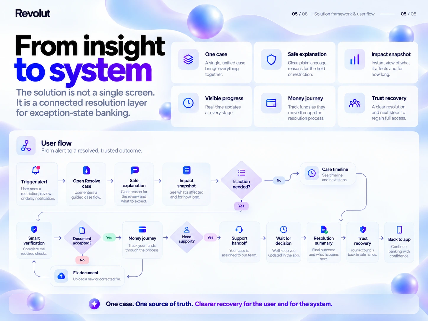
Resolve proposes a unified case containing a safe explanation, an impact snapshot, visible progress, a money journey and a recovery summary. The flow begins with an alert, explains the reason at an appropriate level, shows affected features, requests evidence where necessary and moves into a case timeline. Document correction, specialist support and a closing summary remain connected to the same case.
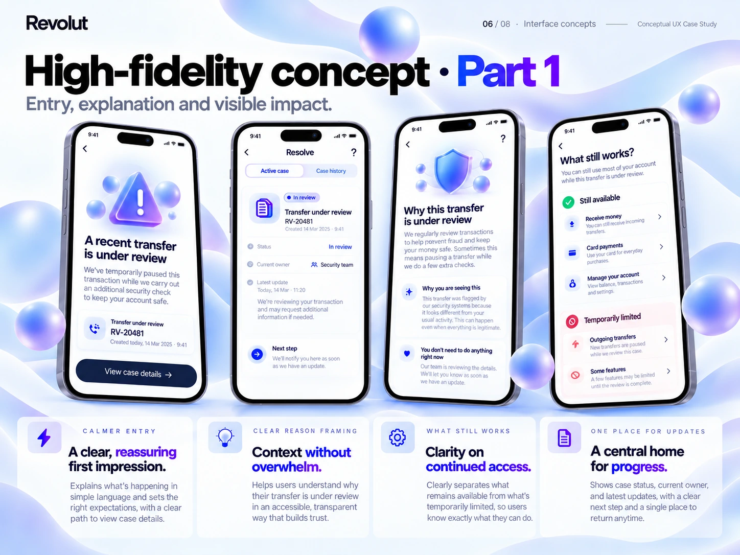
High-fidelity concept · Part 1
A calm entry point with a clear next step.
The first interface set explores the initial alert, a central case home, a plain-language explanation and a view of what still works. The goal is to make the review understandable while separating available features from temporary limits. Case references and status information keep updates connected, with action requirements distinguished from waiting for review.
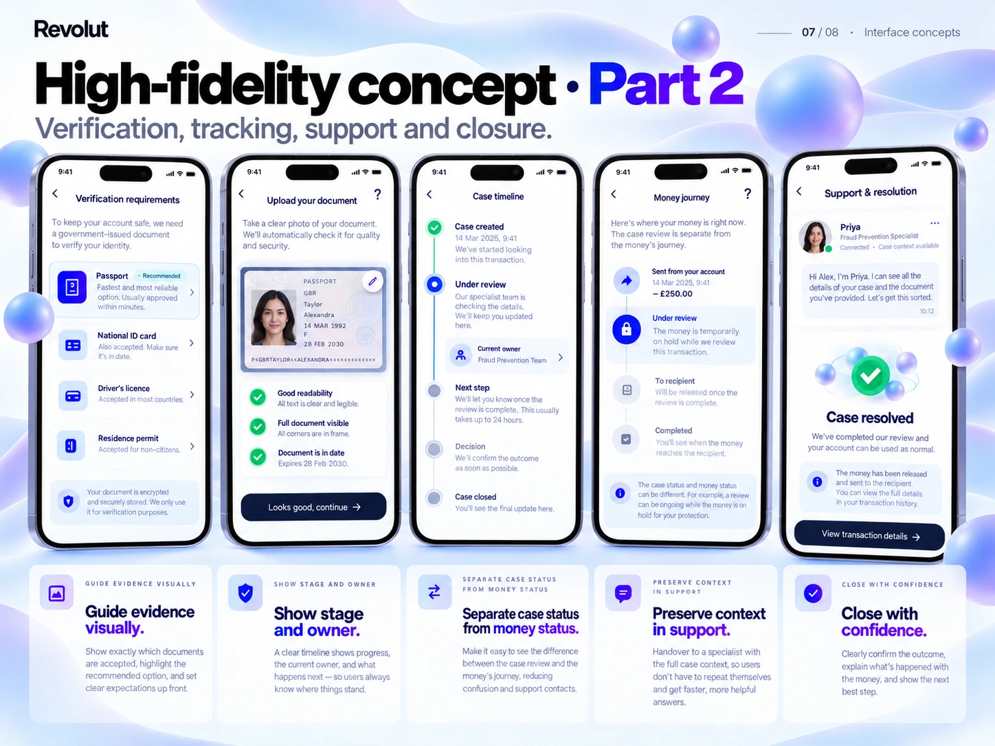
High-fidelity concept · Part 2
Guide verification, tracking, support and closure.
The second interface set explores document requirements, upload guidance, a case timeline, the money journey and support or resolution. Visual evidence guidance aims to reduce avoidable resubmissions. Case status is separated from money availability. A contextual support handoff should preserve prior information, and a resolution summary should explain the outcome and any next step.
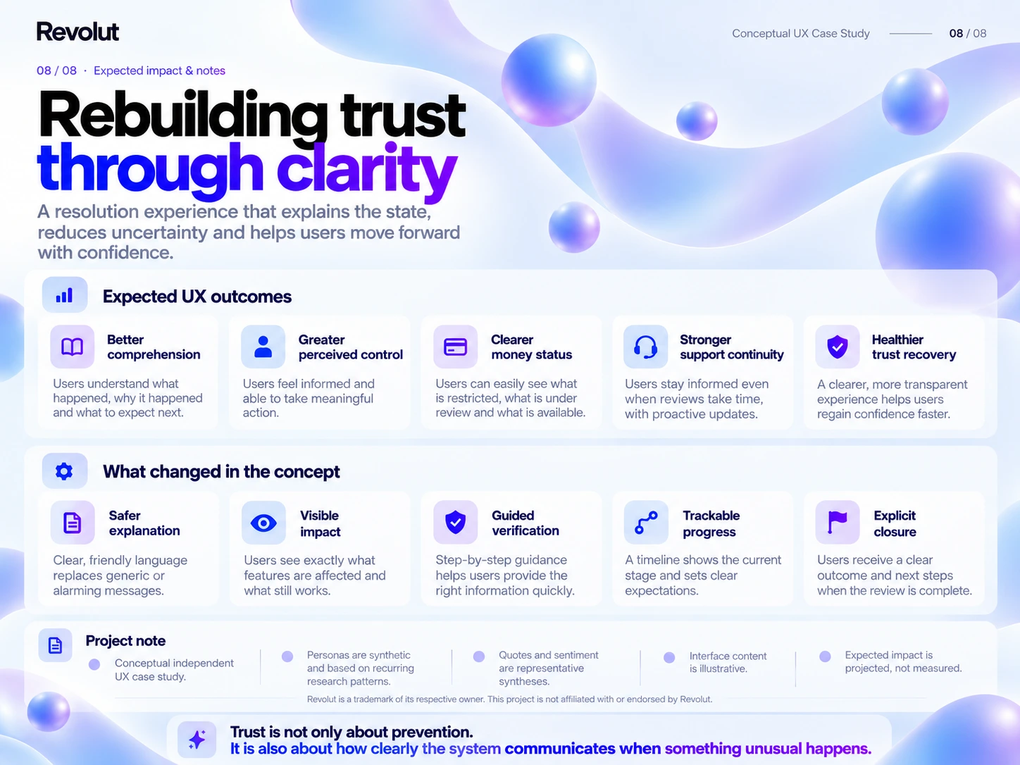
Expected impact
Rebuild trust through clarity.
The intended benefits are better comprehension, greater perceived control, clearer money status, stronger support continuity and healthier trust recovery. The proposed changes are safer explanations, visible impact, guided verification, trackable progress and explicit closure. These are projected benefits, not measured improvements.
Validation plan
Test understanding before claiming improvement.
Future usability sessions should examine whether people can explain the review state, identify their next action, understand a timeline and locate support. Edge cases should include rejected documents, delayed reviews and partial restrictions. Banking, security and support specialists should review feasibility and permissible wording. This completed concept has not undergone participant validation; presentation visuals include AI-assisted compositions.